Natural History Museum of Utah
Brand Guidelines and Capital Campaign
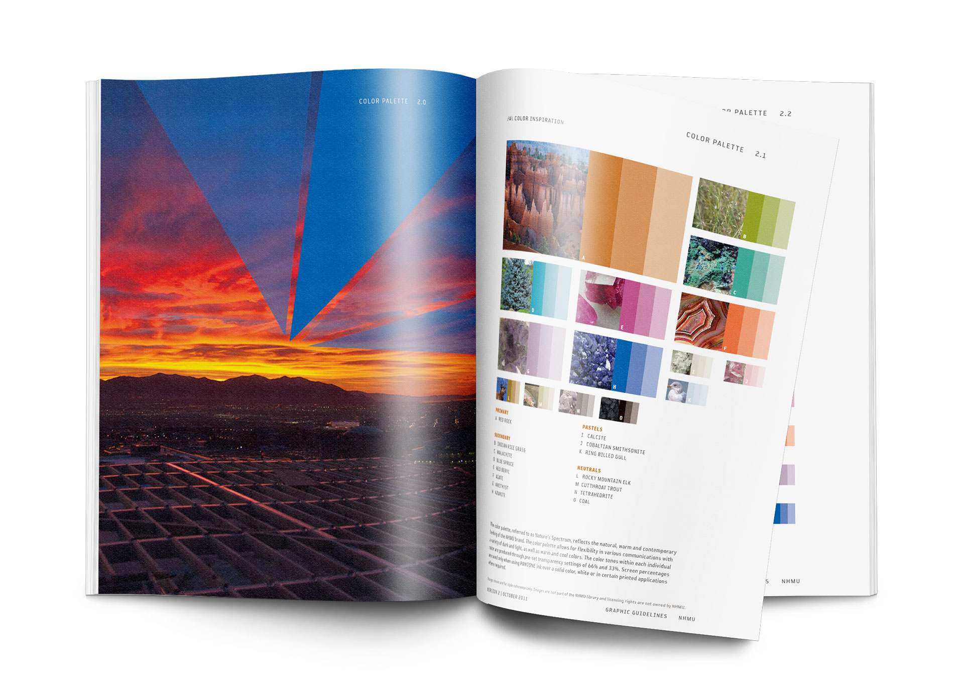
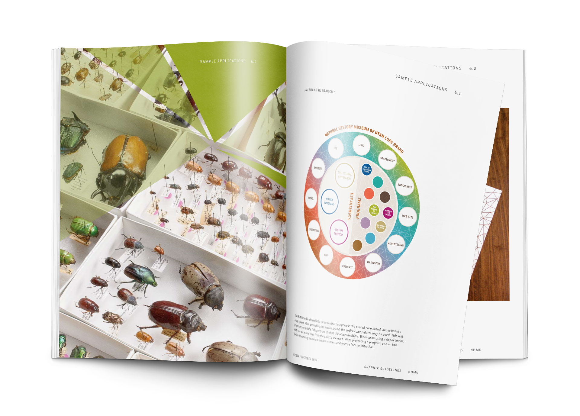
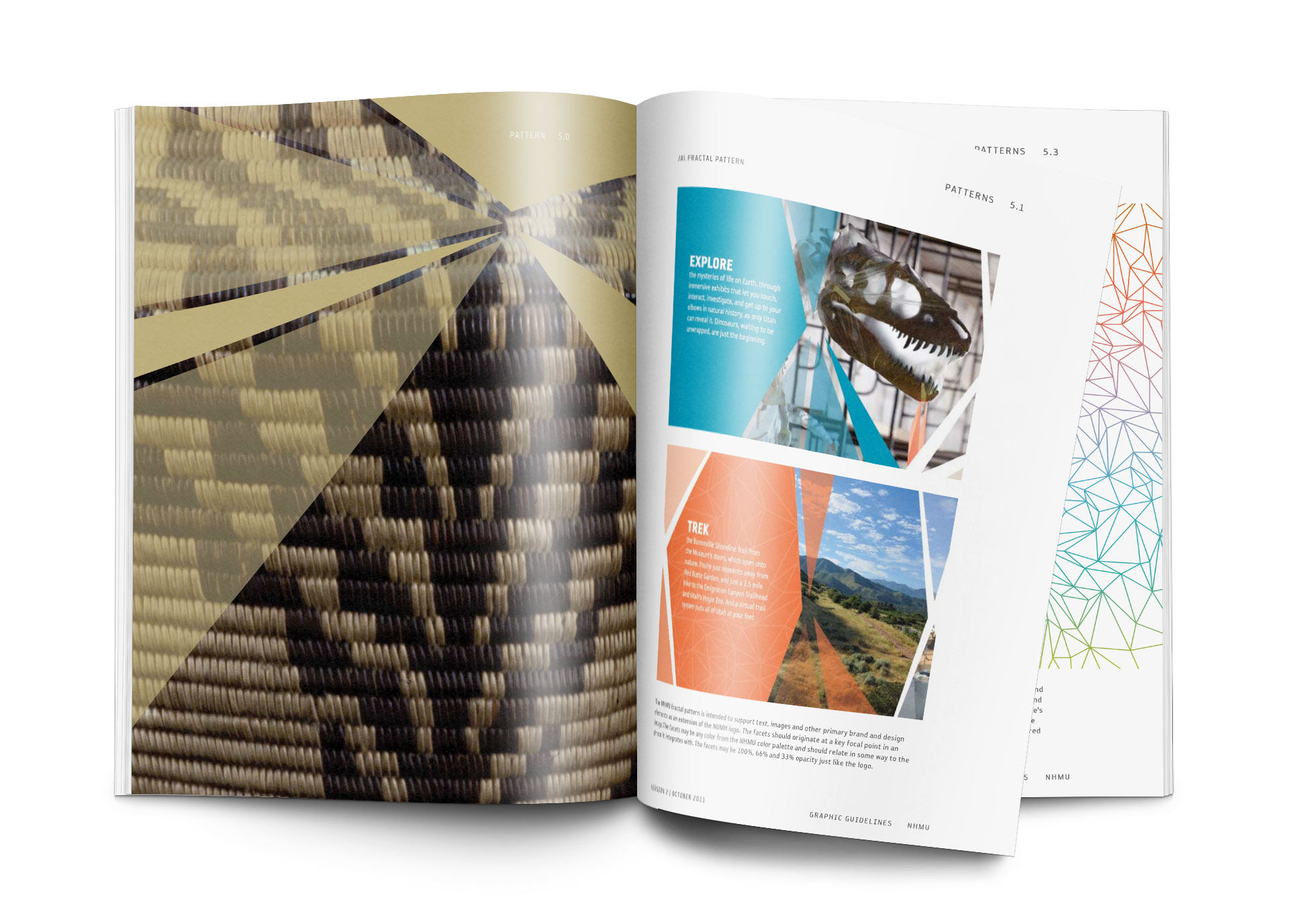
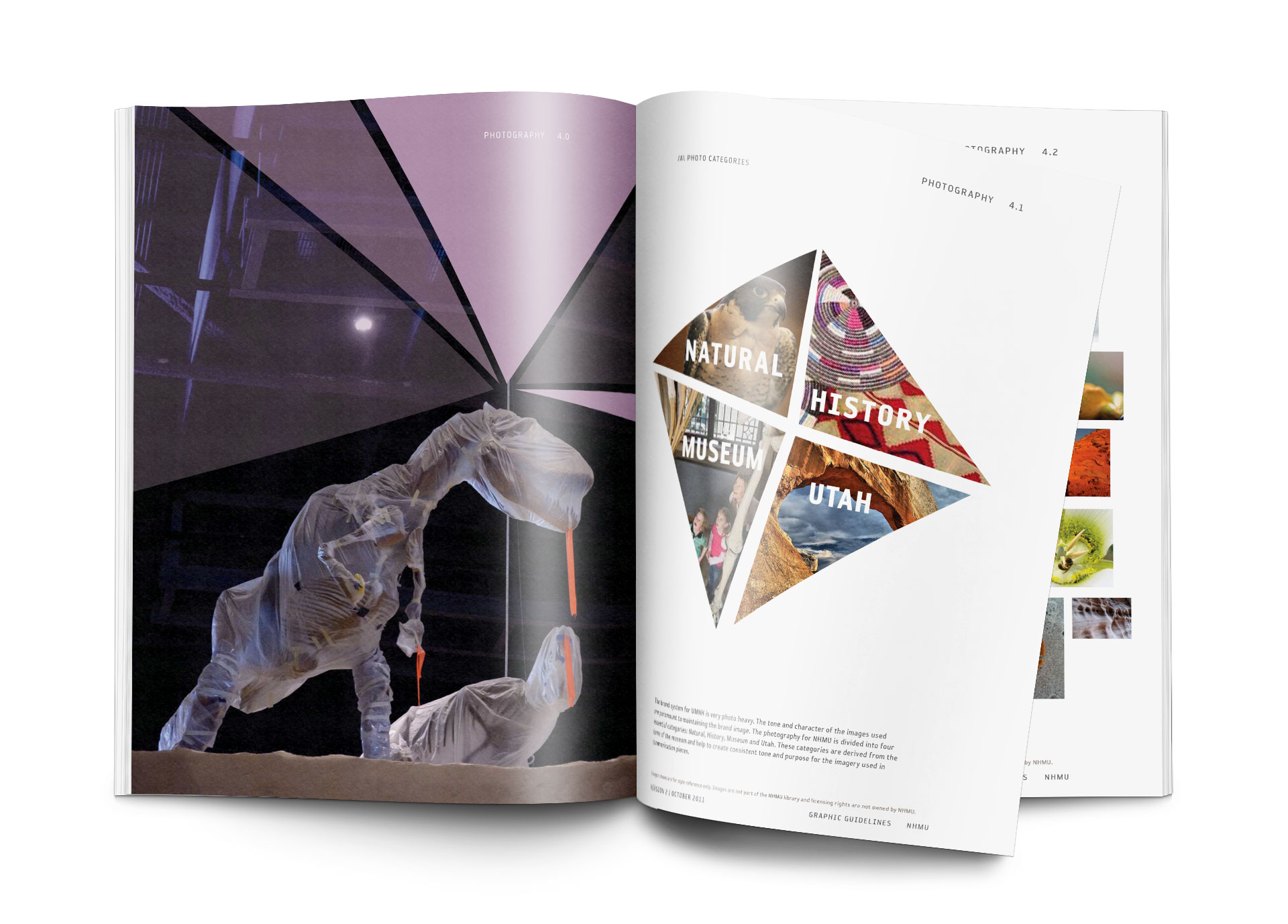
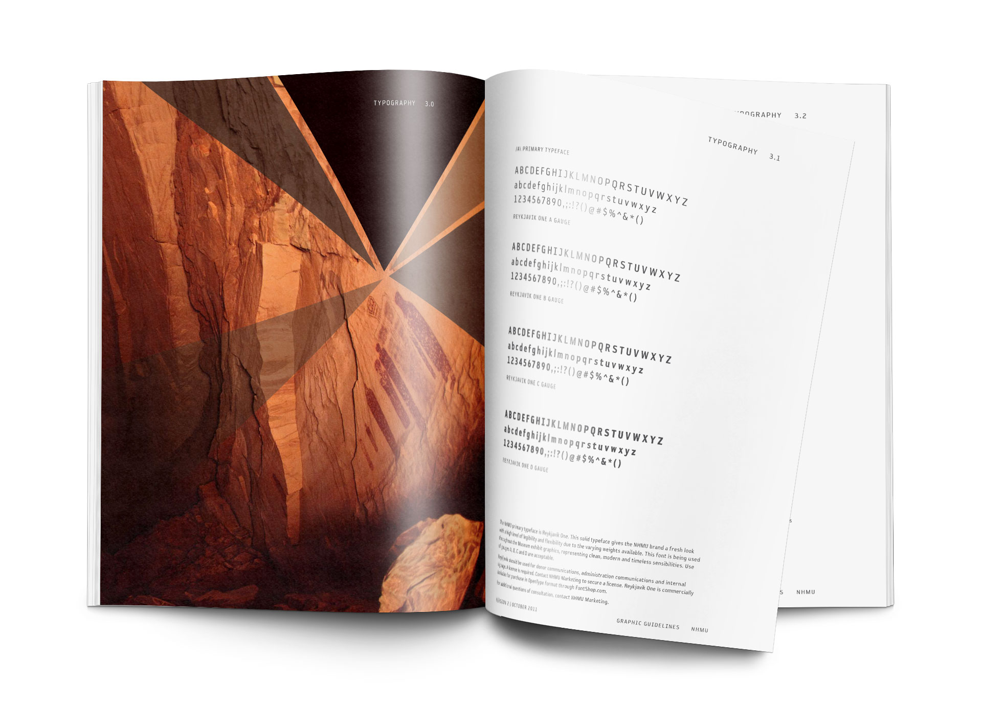
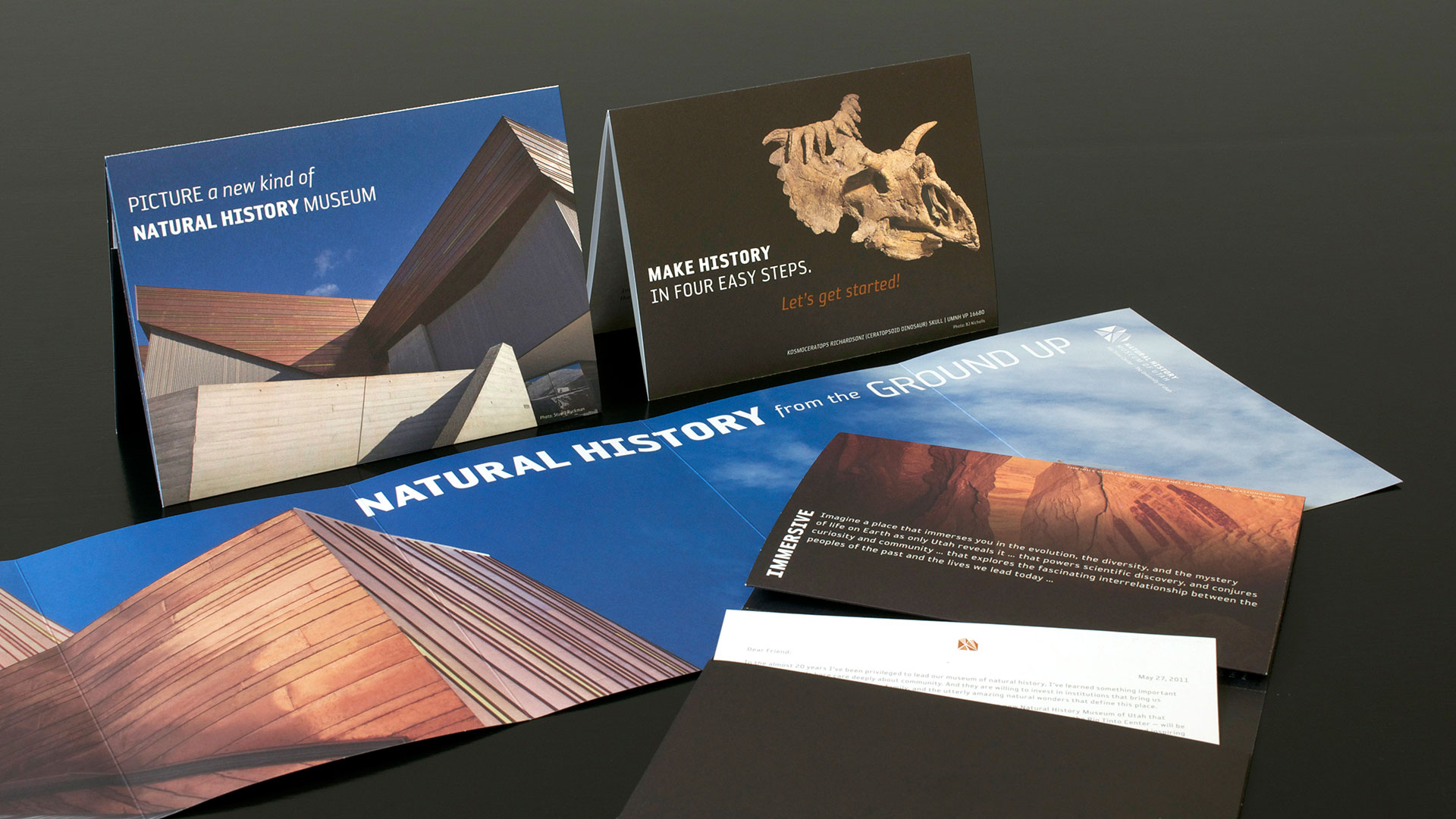
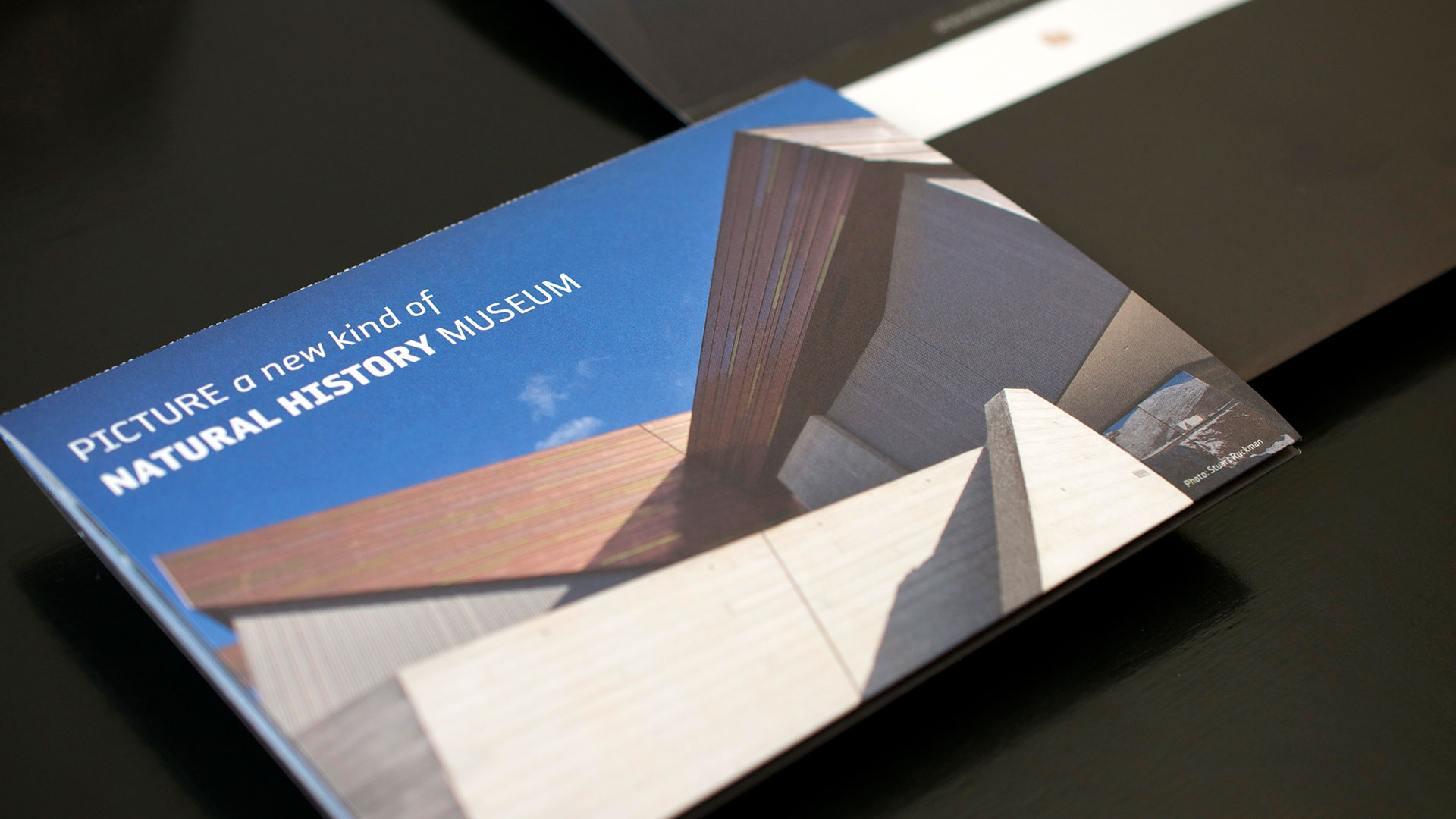
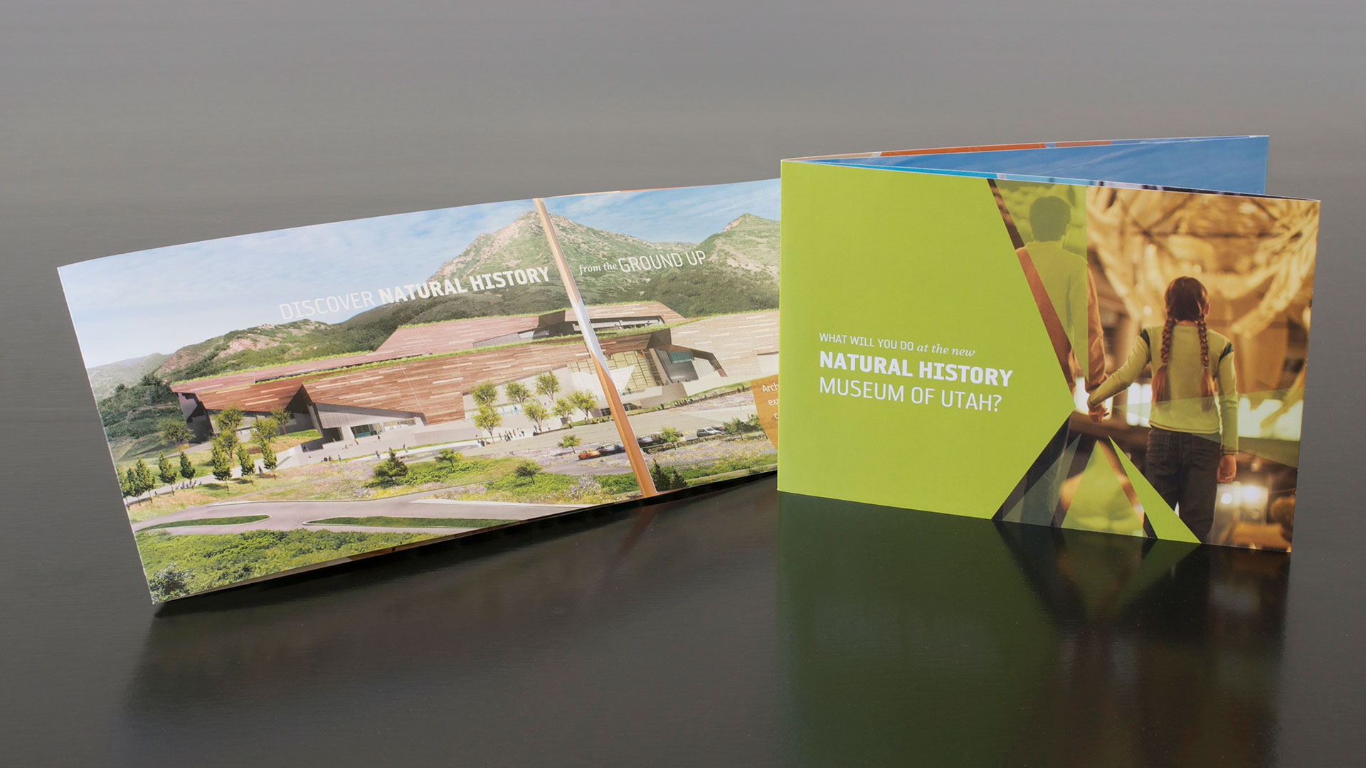
A new location, a new building, a new name, and a new vision brought the Natural History Museum into the upper echelons of museums across the globe. The brand mimics the progressive details of the architecture designed to blend into the surrounding foothills, and is inspired by the state itself.
Role
- Brand Identity Development
- Brand Standards
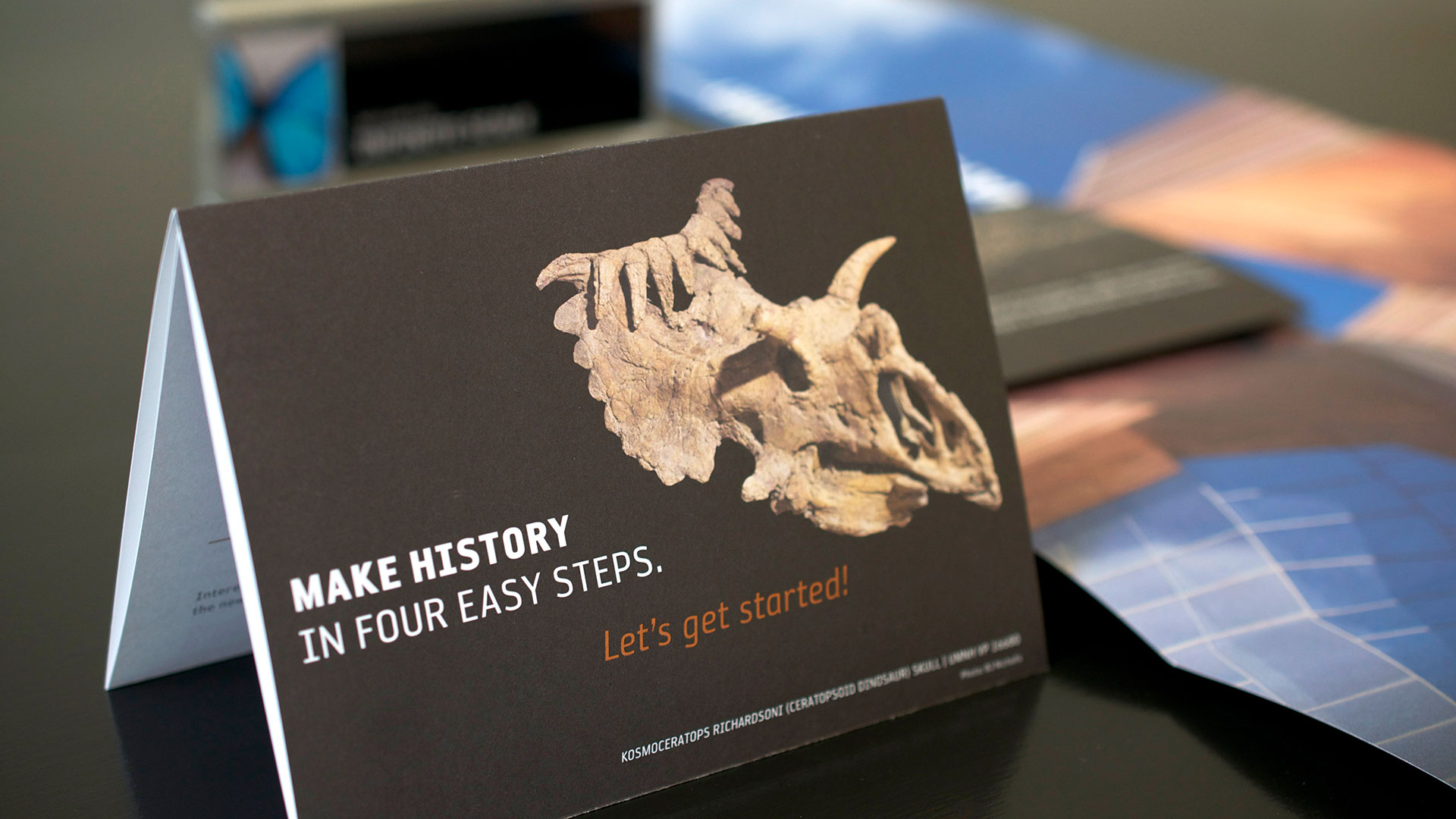
- Capital Campaign
- Creative Direction
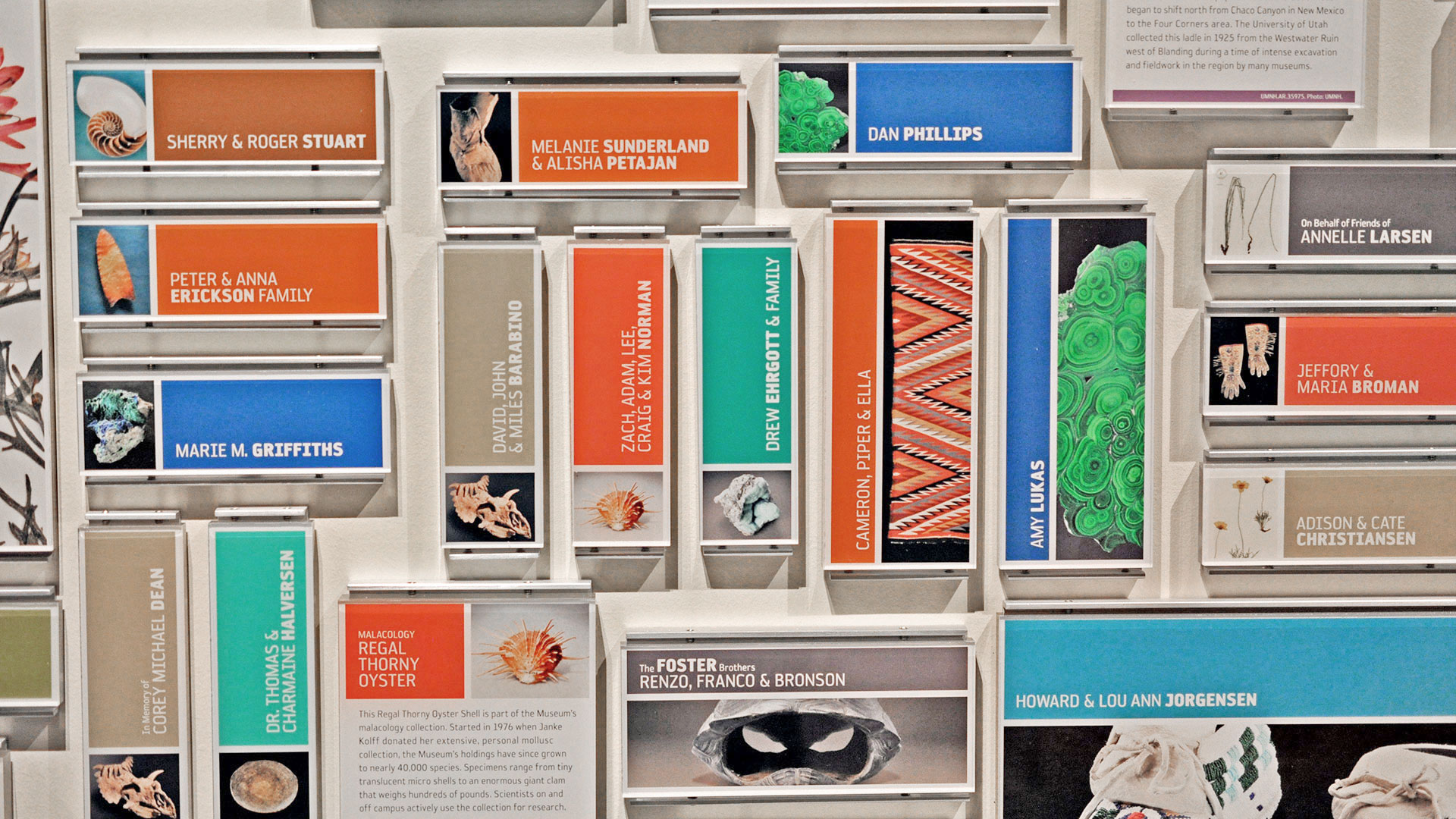
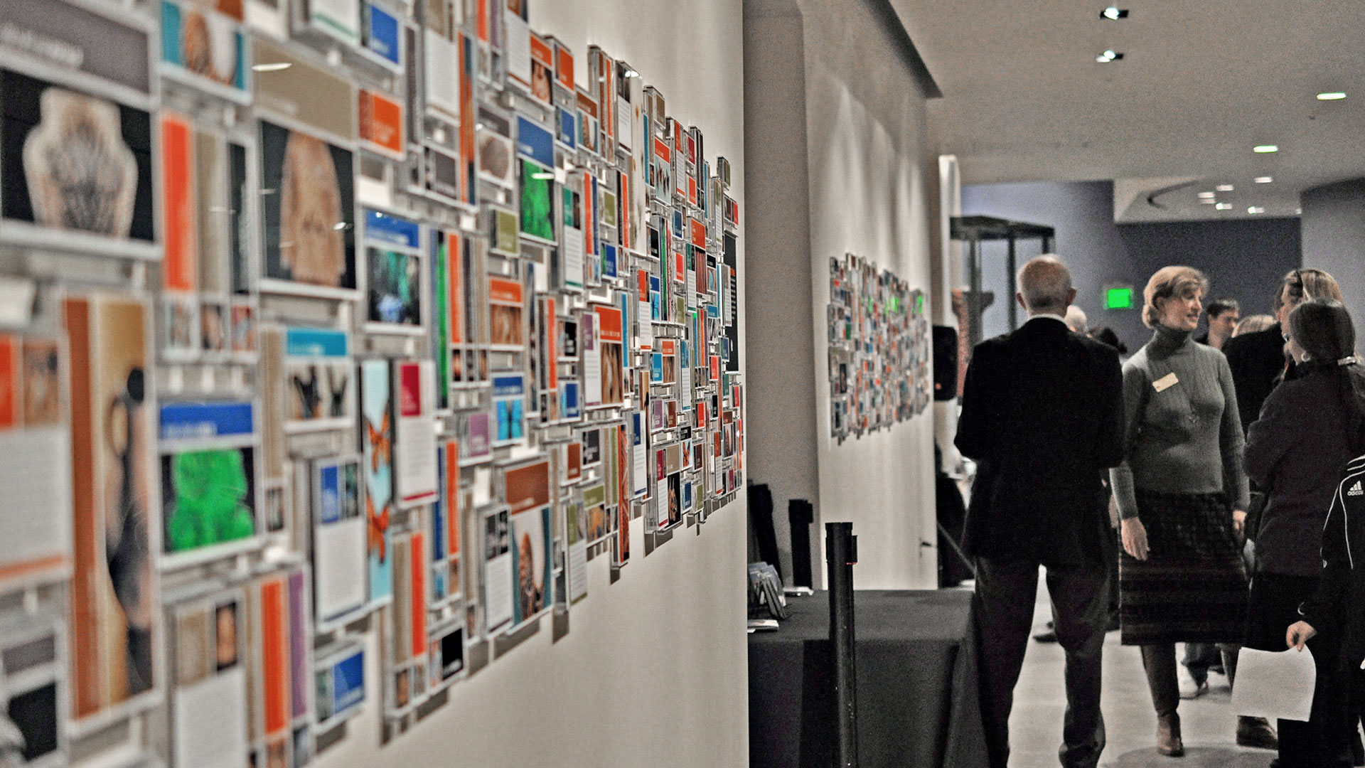
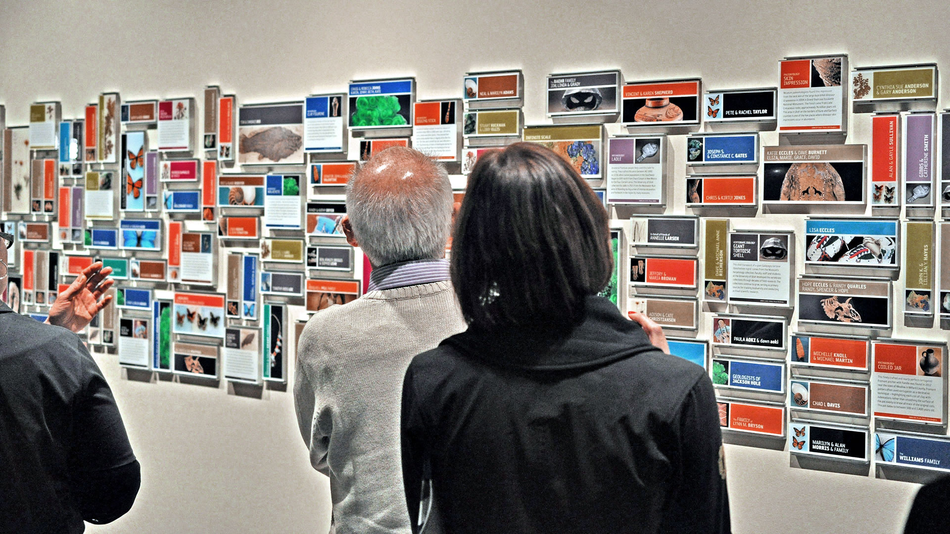
- Donor Recognition Program
- Graphic Design
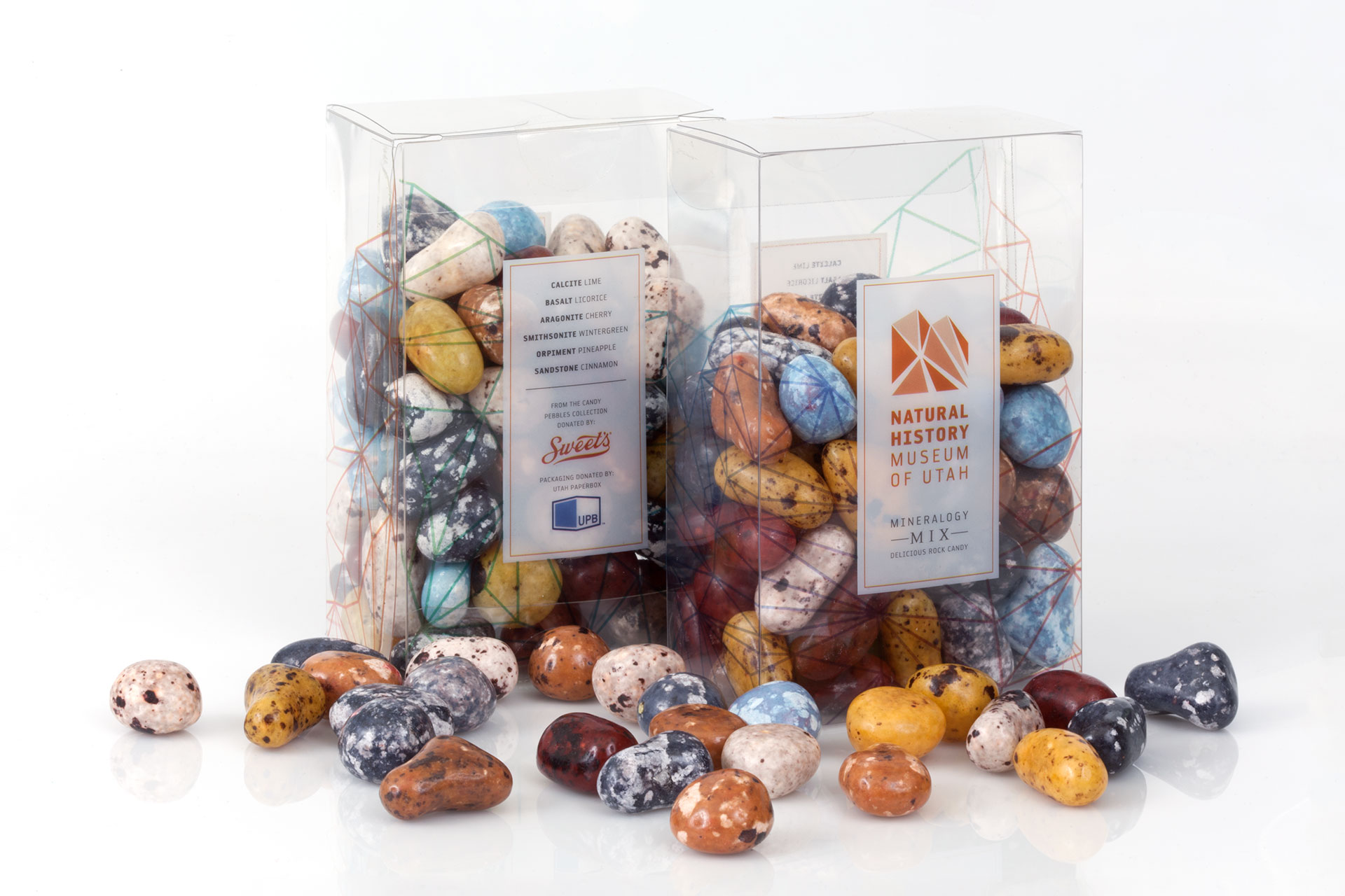
- Packaging Design