Voilé
Re-brand and Season Product Graphics
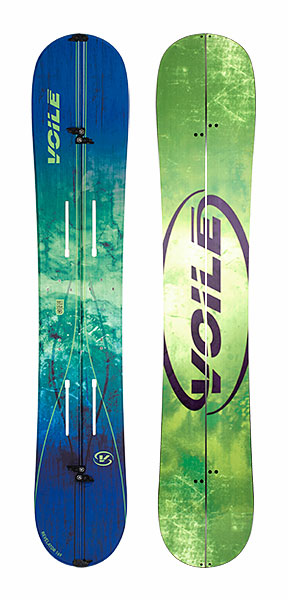
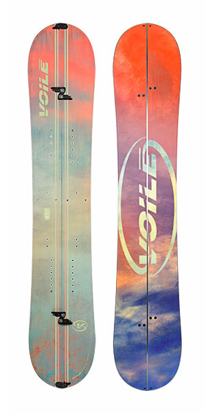
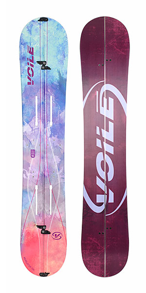
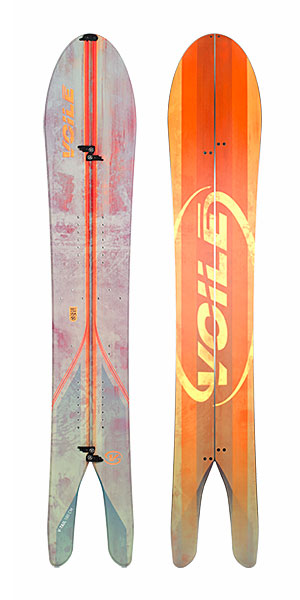
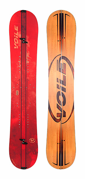
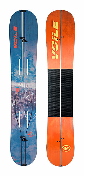
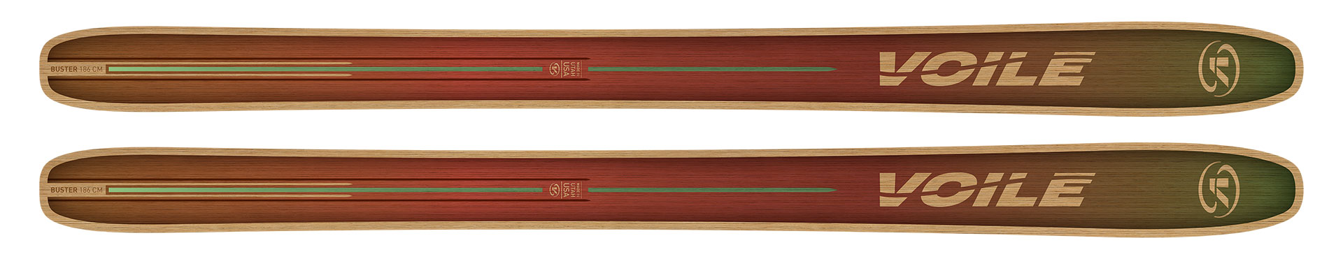
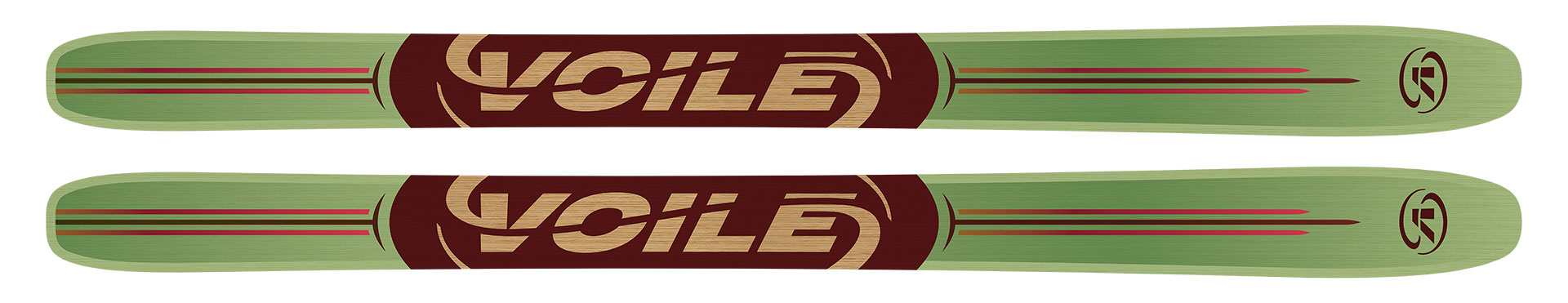
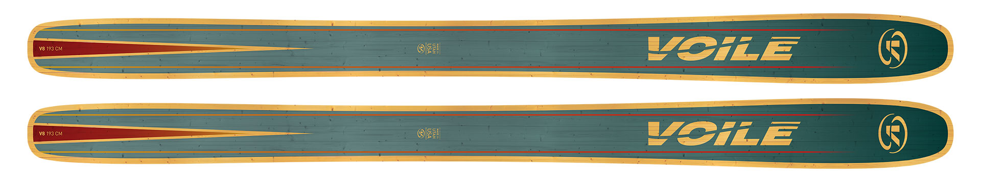
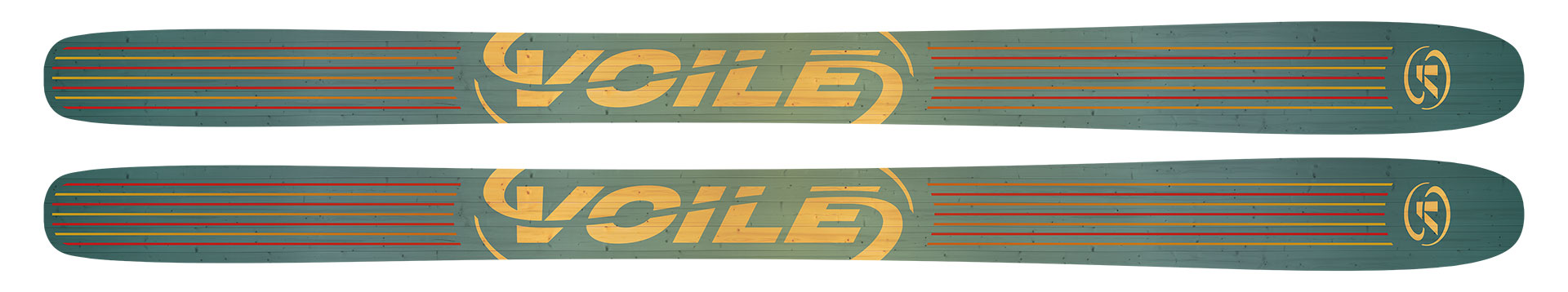
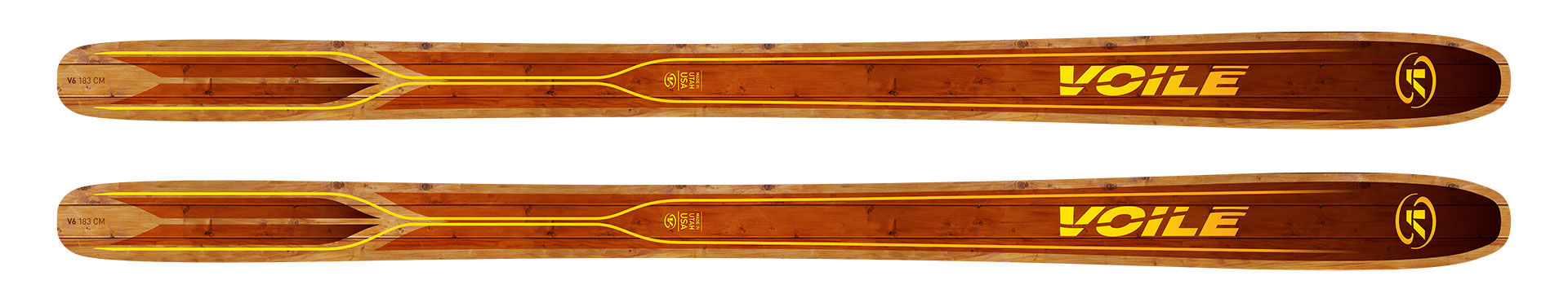
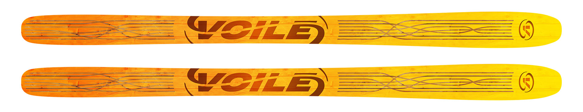
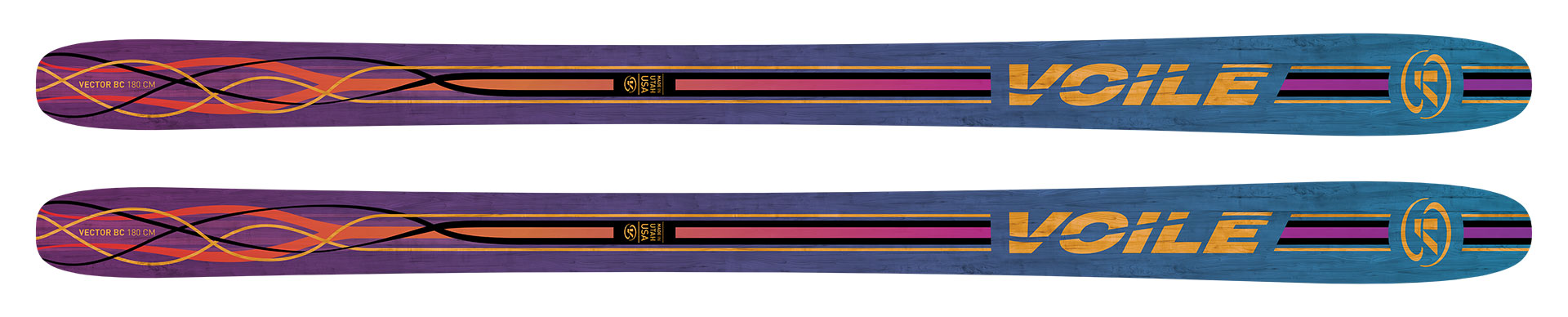
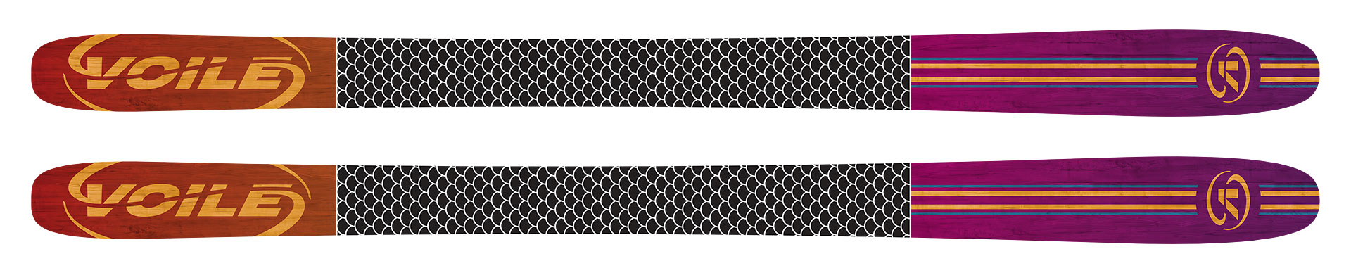
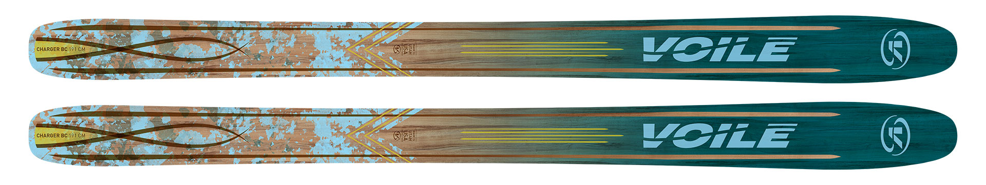
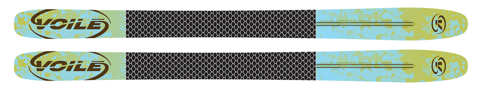
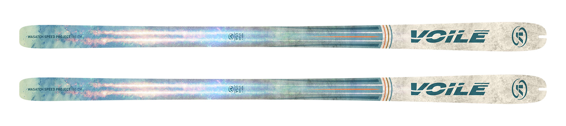
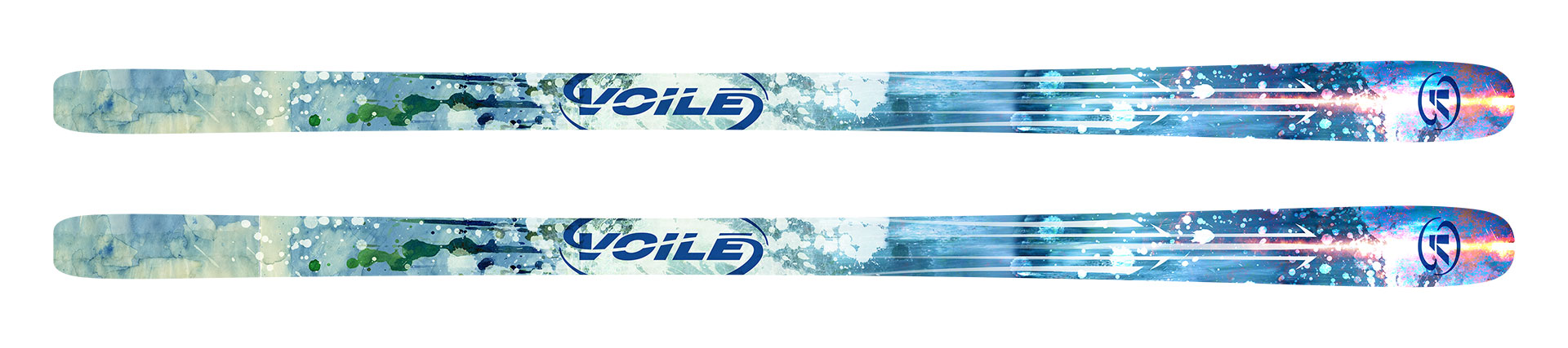
Voilé had over 12 individual non-related company logos. A distilled and unified three logo system was developed and standardized use was created. To celebrate this change, an entirely new comprehensive and thematically unified product line was developed.
Role
- Brand Concept
- Brand Identity Development
- Brand Standards
- Graphic Design
- Product Design