Proper Brewing Co.
Brand Development
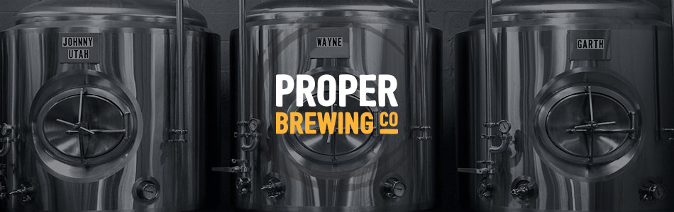
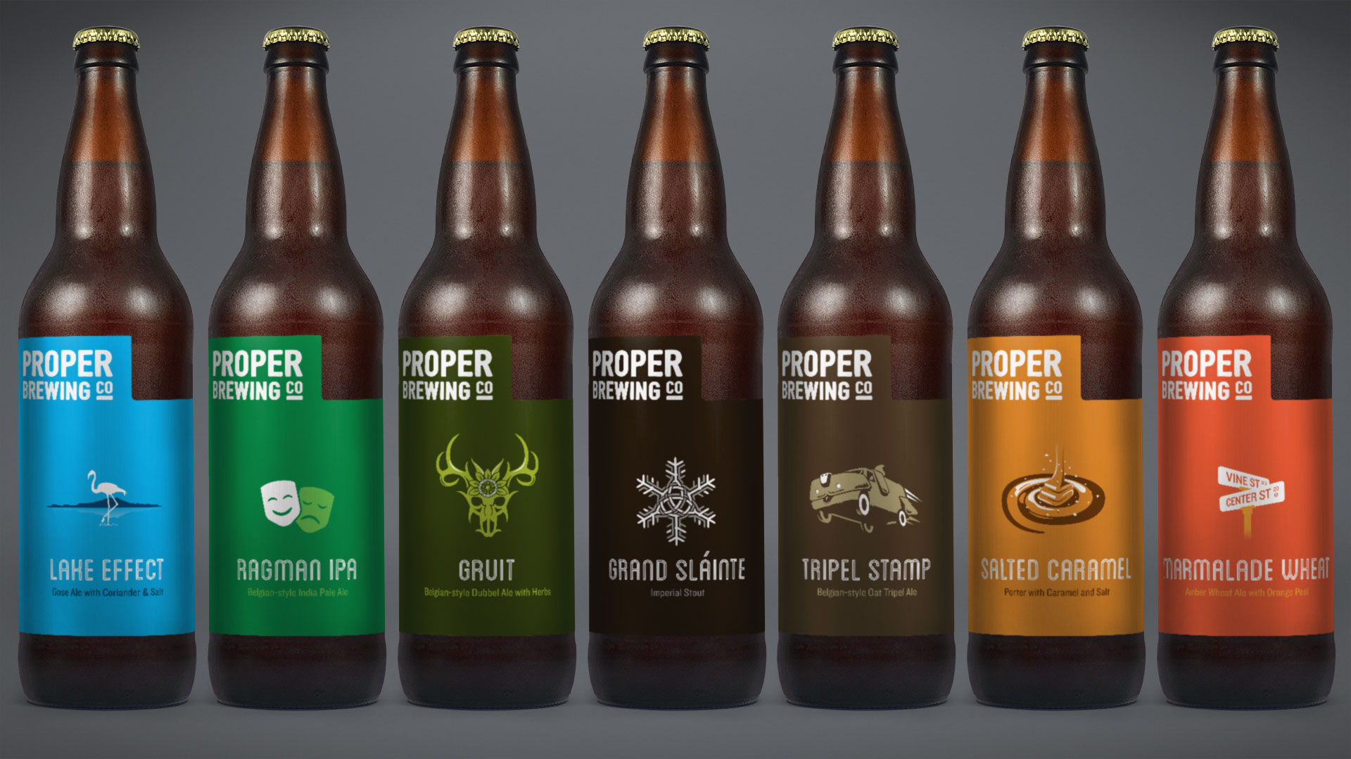
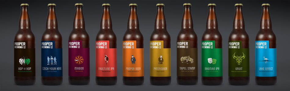
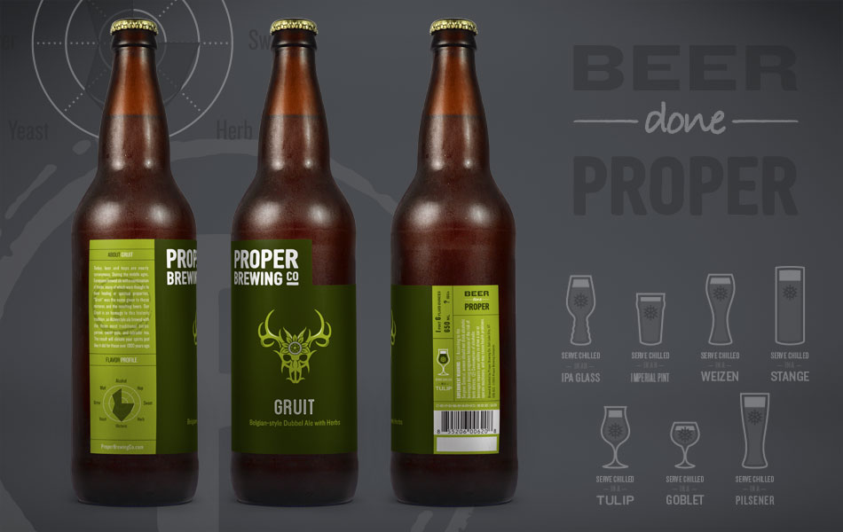
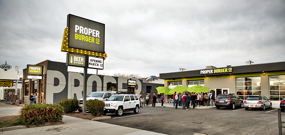
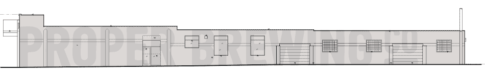
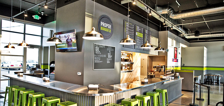
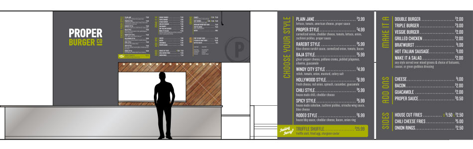
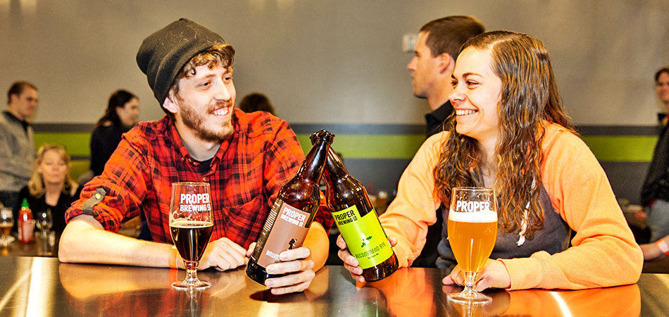
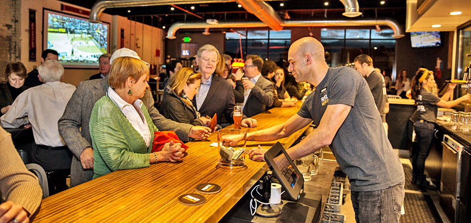
Local beloved bistro and brew pub Avenues Proper was in a time of expansion. They saw an opportunity to grow their brewing business into a full retail beer line and series of bars. They also created a fast casual burger restaurant.
Role
- Brand Standards
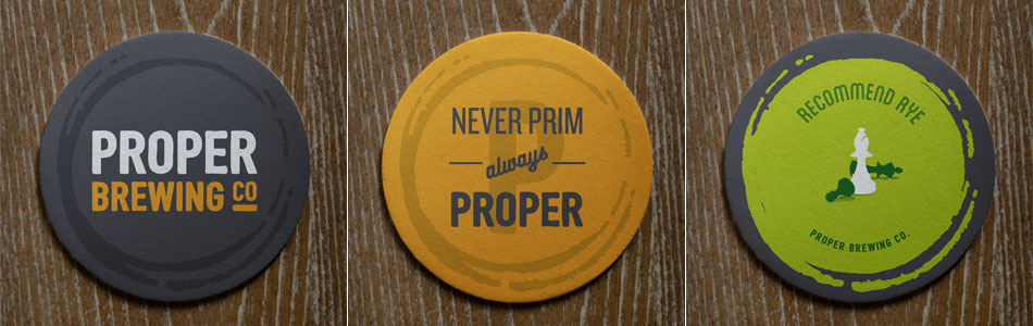
- Brand Identity
- Creative Direction
- Illustration
- Interior Design
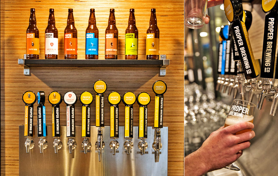
- Packaging Design